Monday, 28 April 2014

Past three weeks I've missed on the blog

Week 6
Started to work directly onto people's faces in different forms, sticking words onto the head and body and then painted onto faces. 
Did some photoshop work writing on photos with tablet and typing

Week 7-8 (Easter holiday)
Worked with the idea of lyrics around the person so used by pass printing and photoshop leading to trying to show the shape or meaning of the lyrics using the lyrics.
Was finally able to write onto a humans back so I had a large canvas and shape to use took photos and sketches with influence from man rays work.

Tuesday, 8 April 2014

Development workshop

Our tutors wanted us to develop one of our images for the day so I worked on a3 and made a new image using lyrics.
This is the original image I did a rough sketch of the girl who sits next to me and then wrote the lyrics to 'a love passed on' and worked this picture.
Sprayed water on it and did not work how I wanted it to turn out.
Using a photo copy I drew using a red pen the same lyrics for a male underneath. I used red and blue because these were the colours a person said in my questionnaire that represented male vocals (red) and female vocals (blue) while the lyrics represent the vocals themselves.

Monday, 7 April 2014

Overview week 5

Because of the text workshop I have started making humans out of lyrics I really enjoy doing this. My transition to this feels smooth and connected to what I have been working on previously because the lyrics are forming both people and objects.

Also I started a new sketch book.

Friday, 4 April 2014

Text workshop continued!

After the large newsprint and ink pieces we worked on smaller a3 size paper and using different medias
In the same situation as merge, freak is the word I chose because it's very dramatic and it describes the creatures being created albeit a very brutal word as well. The way the text is presented also looks freakish, the letters working their way around each other and to me the marks of the shoe polish look like shadows cast upon this freak who is hiding itself from the world.
If it can't be seen which it probably can't be this is supposed to say drum in block lettering. The idea here is that it's the power of the drum going all over the place as the drummer swings their arms up and down just as these letters go up and down. I think I would prefer this if it was then stuck onto another sheet of paper, probably a piece of coloured paper which reflects the drums.
I'm not sure how I feel about this one. I would of preferred to of written the lyrics in the background in pen so they were clearer and I'd like for the ballads to be centred. However I love how the word sing looks here. It looks like an explosion like when a singer projects their voice for all to hear.
Using the left over time and the questionnaire results to quickly make this one. The sax was described as sexy and it's sound was given the red colour. So nothing more nothing less here.

Text work shop

We did a work shop today where we worked with text. Are tutor showed us fonts and we wrote words relating to our project. Mostly at random, as long as they were in some way connected to the project.
I used the word merge because although it's not an instrument or anything to do with music I have been merging instruments with things. The M at the start was too big so I had to make the rest of it small but it all fits on nicely. This is my favourite font and image because I like the black ink and the way the letters look smooth.
I wanted to think of a third three letter word to go on top but couldn't think of anything. I prefer the key text to the sax because doesn't have anything about it while key looks like it has character.
The font we were shown was extremely rough so it was hard to recreate but I like this it feels so free and easy while being harsh and rough at the same time.
Originally I planned to fit song on the page properly but it was too big. I can't really say much about it because it doesn't project anything for me it turned out too dull.

Tuesday, 1 April 2014

Previous week work

Unfotunatly it's upside down but my opinion on the piano face is I hate it it just looks a mess the drum kit head is alright but not as good as the next three.I don't mind this one when it's photographed but the edges are actually rough and it looks unfinished as the collage is rough as well, still looks nice though.
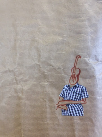
This is one of my favourites I like the two different guitars and that the small one has its head cocked to the left like the body so it flows natrually together. I add the black line to give them something to rest on instead of floating in empty space because both are sitting.
Sexy was one of the words used to describe the saxaphone and the colours red and blue were used to describe its sound. I chose to apply the sax to this body because it's a rather sexualised image (cleavage and legs) so it works with the sound the sax makes.

Ink humans and colourful instruments

These images are observationl drawings of people in class using ink and stick and then over it I used coloured ink, pen and watercolour to draw the instruments. The instruments colours are chosen by using the sound and colour questionnaire I wrote in the previous week.