Monday, 20 October 2014

Transforming The Japanese Comic Tradition - Article Review

The article is about an illustrator, Seiichi Hayashi, and his experimental comic books/manga. In the first half of the review it talks about how comics as an art form is still an unexplored area and how Hayashi has worked towards a new idea of as well as his past works and his time at the manga magazine company 'Garo'. His works don't always have a point to them e.g. he first draws the pictures with no story in mind but then adds text to them to give them meaning.

The second half of the article is the interview with Hayashi himself, when he went to London, how he constantly alters and changes his style with each piece and the themes for inspiration and influences he looks into. they also ask about his opinions on illustration and animation as well as how he worked experimentally with narrative and image.

I really like the article because it is redefining the idea of, and how people perceive japanese comics/manga, giving the idea that its not just comic books but can be art to be viewed in a gallery.

Wednesday, 11 June 2014

Male and Female versions of the song


Lining up x2

With this version i wanted to line up the vocals so that they became clearer and you can hear what they sound like as well as tell what the song is. All details about the next few films is in my sketch book.

overview weeks 9 to 14-15 (yes i missed quite a few)


  • I continued to work on the use of text by making the text in the shape of items and people, i also looked at different types of text and how to present it with fonts etc.
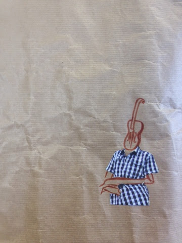
  • I was finally able to work on some ones back, namely my sister so i did quick sketches of the back. i started trying to merge the image with instruments like guitars and violins. i did many variations of it and then found one which i really liked.
  • As well as drawing the picture of the back i painted lyrics on my sisters back, as well as f's that are found on violins.
  • I tried making pictures using sound vibrations, i used ukelele strings and a bugle

Afterwards i continued with my prints and the films i did present in my book and on the Blog.
Im disappointed i couldn't keep to the overview a week schedule i wanted to do originally.

Tuesday, 3 June 2014

Addition of Colour


after looking at Norman McLaren and his brightly coloured animations i tried to apply colour into my film like a filter. i looked back at my sound and colour research and decided to try and overlay the colours in the rainbow because people described the vocals as versatile like the rainbow.

Im not entirely sure wether i like it or not because it feels like the film has too much ring on.

Attempt at lining up

i tried overlapping the film with the music but an issue is that the music is longer than the film so i have split the film in to two halves to see how it works (this means speeding it up). this essentially means that the song and film will not be in time with each other however you can't really see them singing any way so i don't feel it matters too much.

Saturday, 31 May 2014

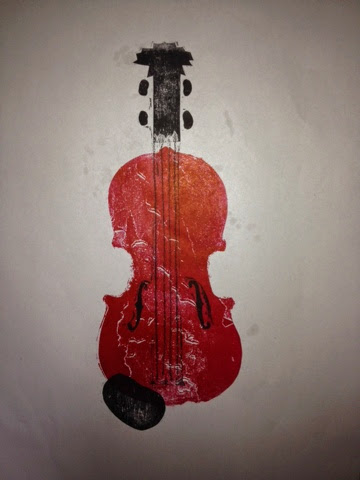
The other violin prints

These are the prints I did using collageaph printing.
These two prints (above) I didn't re ink on the second time it was done with leftover ink.
I looked back at my sound page and found that people said that the sound produced was brown so I printed with brown although I feel it looks red. Brown is also the colour a violin is normally.
These are the first two testers that I did the black print was originally all connected but the rest broke off so the rest ended up on the other side.

Friday, 30 May 2014

few more films

The film below is my second attempt at over laying films. this went a lot better than the first one because at times i could see different peoples faces but only for a few moments and it all looks very faded.
This is a little bit experimental, i took a line from each person and cut it together i don't feel it worked to well though because the lines are very quick so it moves from one person to the next quickly so i don't really like it.

Tuesday, 20 May 2014

Do a- Do- female- a de-Do

I have been wanting to use sound in my project for quite some time now but never really knew how to utilise it. it also moved drastically away from what i'd call a visual communication piece and more to a fine art piece. After the prints of the instruments i made i looked at the book 'Soundings a Contemporary Score' which was about a gallery full of multiple artists (with different variations of the word artist). While i couldn't really find anything of ultimate interest but the concept of sound art is interesting. so i decided to move from instruments to the human instruments i.e vocals. i booked the studio and planned to film, draw and record people while they sang. i wasn't entirely sure of how this would go. it sounds like an out of tune, out of time choir this is partly because some didn't actually know the song which was Do, Re, Mi. 

The film was more successful i think but it could of been better because as i layered the films on top of each other by the fifth film i lost the first and by the end i had about only 3 being visible so i am going to redo this and try to alter the opacity, i feel it will be a combination of maths and trial and error in order to get it right.

Friday, 16 May 2014

Violin in a blue explosion

Using the bugle blasts as a base, after photocopying them I did what I did with the ukelele strumming; I printed a violin onto it in black to see how it looks.
I was surprised at how much the blast over powered even black so when i used red I almost lost it amongst the ink.
I tried bypass printing them this one was the wrong way round.This was the right way round but it just got over powered by the blue explosion 


Friday, 9 May 2014

Bugle type 2

These are the second attempts at bugle art. I used less ink but there wasn't enough I think this time because I think it just fell out it made nice marks though.
This attempt was done on a wall I don't dislike it but it doesn't leave enough of an impact for me. Maybe if I add lots of ink like the first one...

Explosion

The Action: Similar to the ink on strings I filled a bugle with ink and blew. I didn't know how much ink to put in so using newsprint paper on the class floor I held the bugle over the paper and blew. It went every where it was certainly spectacular but it went every where.
The aftermath: I had a friend help peel away the paper and it left an interesting mark where it had been and an outline of the paper. I think it almost looks better than the result.
The Result: it is mostly blue but has a few splatter off shoots around the edge but most went on the floor. The ink spread across underneath leaving sort of wave like patterns.


Thursday, 8 May 2014

Double bass - scale up

Using a double bass I did large a2 prints. Unlike the violin which had a cover on it (I think it was laqure if that's how it's spelt) the basses was worn away leaving a much rougher texture making it hard to get ink off and causing the print to have a mottled look.

Other violin print works

Using the back of the violin I printed red onto the black front so the red shows through the gaps and f's.
I tried continuously printing the violin but it took ink very quickly so the next two prints were weak.
I did multiple coloured prints of the violin then using the ukelele strings printed strings onto the violins.
Same as the previous works just on the vibration background.

Printing in colour and bypass

These prints make use of bypass printing. Using an image from the human and instrument I by passed it onto a print which I did on the vibration ink splatters.The lower one is a mistake the bypass is upside down.
No bypass here but just trying a few colours.

Printing instruments

As well as looking at sound waves and vibrations I also tried printing with instruments. This proved to be difficult but effective. I started with just my ukelele and the only part which is interesting is the strings the back doesn't leave much and it's not quite as, elegant as a violins. The college has multiple broken instruments mostly orchestral string instruments like violins even a large double bass and because they don't have strings I can easily print the body's and the f's look brilliant to me. I was reluctant to put so much ink onto something that isn't mine but it comes easily enough. The strings here are the ukelele strings I was trying to make a violin again.

Tuesday, 6 May 2014

Vibrations and Sound waves

This is from last week where I looked at sound and vibration, moving in a different direction than the merging of humans and instruments. Using the ukulele strings I coated them in ink and while posting a sheet of paper through plucked the strings. It makes me think of shock or sound waves with how it looks jagged and zig zagged.

Monday, 28 April 2014

Past three weeks I've missed on the blog

Week 6
Started to work directly onto people's faces in different forms, sticking words onto the head and body and then painted onto faces. 
Did some photoshop work writing on photos with tablet and typing

Week 7-8 (Easter holiday)
Worked with the idea of lyrics around the person so used by pass printing and photoshop leading to trying to show the shape or meaning of the lyrics using the lyrics.
Was finally able to write onto a humans back so I had a large canvas and shape to use took photos and sketches with influence from man rays work.

Tuesday, 8 April 2014

Development workshop

Our tutors wanted us to develop one of our images for the day so I worked on a3 and made a new image using lyrics.
This is the original image I did a rough sketch of the girl who sits next to me and then wrote the lyrics to 'a love passed on' and worked this picture.
Sprayed water on it and did not work how I wanted it to turn out.
Using a photo copy I drew using a red pen the same lyrics for a male underneath. I used red and blue because these were the colours a person said in my questionnaire that represented male vocals (red) and female vocals (blue) while the lyrics represent the vocals themselves.

Monday, 7 April 2014

Overview week 5

Because of the text workshop I have started making humans out of lyrics I really enjoy doing this. My transition to this feels smooth and connected to what I have been working on previously because the lyrics are forming both people and objects.

Also I started a new sketch book.

Friday, 4 April 2014

Text workshop continued!

After the large newsprint and ink pieces we worked on smaller a3 size paper and using different medias
In the same situation as merge, freak is the word I chose because it's very dramatic and it describes the creatures being created albeit a very brutal word as well. The way the text is presented also looks freakish, the letters working their way around each other and to me the marks of the shoe polish look like shadows cast upon this freak who is hiding itself from the world.
If it can't be seen which it probably can't be this is supposed to say drum in block lettering. The idea here is that it's the power of the drum going all over the place as the drummer swings their arms up and down just as these letters go up and down. I think I would prefer this if it was then stuck onto another sheet of paper, probably a piece of coloured paper which reflects the drums.
I'm not sure how I feel about this one. I would of preferred to of written the lyrics in the background in pen so they were clearer and I'd like for the ballads to be centred. However I love how the word sing looks here. It looks like an explosion like when a singer projects their voice for all to hear.
Using the left over time and the questionnaire results to quickly make this one. The sax was described as sexy and it's sound was given the red colour. So nothing more nothing less here.

Text work shop

We did a work shop today where we worked with text. Are tutor showed us fonts and we wrote words relating to our project. Mostly at random, as long as they were in some way connected to the project.
I used the word merge because although it's not an instrument or anything to do with music I have been merging instruments with things. The M at the start was too big so I had to make the rest of it small but it all fits on nicely. This is my favourite font and image because I like the black ink and the way the letters look smooth.
I wanted to think of a third three letter word to go on top but couldn't think of anything. I prefer the key text to the sax because doesn't have anything about it while key looks like it has character.
The font we were shown was extremely rough so it was hard to recreate but I like this it feels so free and easy while being harsh and rough at the same time.
Originally I planned to fit song on the page properly but it was too big. I can't really say much about it because it doesn't project anything for me it turned out too dull.

Tuesday, 1 April 2014

Previous week work

Unfotunatly it's upside down but my opinion on the piano face is I hate it it just looks a mess the drum kit head is alright but not as good as the next three.I don't mind this one when it's photographed but the edges are actually rough and it looks unfinished as the collage is rough as well, still looks nice though.
This is one of my favourites I like the two different guitars and that the small one has its head cocked to the left like the body so it flows natrually together. I add the black line to give them something to rest on instead of floating in empty space because both are sitting.
Sexy was one of the words used to describe the saxaphone and the colours red and blue were used to describe its sound. I chose to apply the sax to this body because it's a rather sexualised image (cleavage and legs) so it works with the sound the sax makes.

Ink humans and colourful instruments

These images are observationl drawings of people in class using ink and stick and then over it I used coloured ink, pen and watercolour to draw the instruments. The instruments colours are chosen by using the sound and colour questionnaire I wrote in the previous week.

Sunday, 30 March 2014

Over view of weeks 3 and 4

unfortunately i forgot to do an over view of week 3 and i havent put much stuff up recently which i have so i will be posting that tomorrow, (that being the out of book work)

Week 3
i drew my singing teacher playing the sax while her husband played the double bass. i used multiple medias and different colours. it was while looking at these that i found i could look at the connection between colour and sound.

i made a short questionnaire of what are your three favourite instruments what sound do you feel it makes and what colour would you apply to these instruments and sounds. i printed around 20 of them.

Week 4
we did a collage work shop so i worked using the idea of combineing instruments with humans which wasnt very good at the start but when i started using different media they started looking quite nice.

i want to try looking at merging more objects and humans with instruments however i feel like I've come to a dead end and i didn't get much work done which im not happy about.

Monday, 17 March 2014

Over view of past week 2

Really two things happened last week that was the London trip and the Observational drawings of my singing teacher.

First the London trip
I went to the V and A and looked for instruments but unfortunately there were less than I expected being mostly forms of pianos (grand and harpsichord) and then I tried to combine the drawings with passers by which went okish.

Jam Session Observations
Yesterday I drew my singing teacher and her husband playing the sax and double bass which was so much fun to listen too  I found that the double bass makes me think of deep green while the sax makes me think of a bright orange. When played together they seem to be bright green and strong red.

I also found out about an artist called jenny soep who draws musicians while they perform which I really like I have yet to add her to my book.

Other Jam Session Artwork

This piece is hard to see what it is because I used a thin pen on music scores that had just been painted with water colour I wanted to try it with a bit more variety. I used the brown and yellows because those are the colour of the instruments
I'm not sure about this one, I like its positioning and idea so musical scores and drawings seperate but the drawing seems very lack luster. I used the colour of the instruments sound but the drawing is very poor. It was first drawn in pencil then the chalk went on top.
I really don't like this one it's too basic and has no feeling to it. It's just grey and dull. I used grey to try and use more grey and black media but it was a bad idea.
I first did water colour block of the double bass then went over in pen but because it was wet the pen faded and didn't leave enough of a mark but it doesn't look too bad.

Musical Jam Session

This picture was done on stretched paper. It is of my singing teacher and her husband playing the sax and the double bass.
I started by doing a rough drawing in pencil of them and then drew another one in pen, not going over the pencil but using it as a guideline so that the pen was proportionet (this was mainly for the double bass because it's massive). 
I wanted to apply more colour so I used water colours on the instruments but it felt empty. Using chalk I drew blocks of the instrument heads.
I chose the colour of the chalk specific to the sound the instrument gave off. So a double bass produces a deep mellow tone which made think of the deep green while a sax is active and bright like the colour orange. I wish that the two of them were closer in the picture because they were in real life so I'm disappointed and the chalk became a bit over whelming.